The Mighty 5

The Mighty 5
Client:
Tool:
Date:
Category:
The first step in the project was identifying the overall goal and defining what the website needed to accomplish. The project focused on Utah’s five national parks—Arches, Bryce Canyon, Canyonlands, Capitol Reef, and Zion. These parks provided a clear focus for the content and visual identity of the site.
Accessibility was a major priority. Because the goal was to help people explore places they may not be able to visit in person, the site needed to support a wide range of users. Early planning focused on clear navigation, large clickable elements, and strong color contrast to improve usability.

After defining the strategy, the next step was planning the structure of the website. The site was organized into a home page, an about page, and five park pages. Each park page included trail cards that linked directly to the VR tours.
Keeping the structure simple was important so users could easily navigate the site and understand where to find information. The homepage was designed to introduce the project and guide users toward the individual park pages. The park pages then provided more detailed information about each park and access to the VR experiences.

Once the structure was planned, we began creating wireframes to explore different layout ideas. Multiple iterations were created for the homepage, navigation, and park cards. These early designs helped us test how information would be organized before moving into more detailed visual designs.
Accessibility continued to influence the design during this stage. Interface elements were designed to be large enough for comfortable interaction, especially for users with tremors or limited motor control. We also focused on maintaining a clear visual hierarchy so users could easily understand what content was most important on each page.

The visual style was inspired by national park landscapes and outdoor design references. Color palettes were based on desert and forest tones found in Utah’s parks. The goal was to create a design that felt connected to the natural environment while still maintaining readability and consistency.
Typography and visual references were also influenced by national park signage, outdoor posters, and field guides. These references helped create a cohesive style that was unique to the project yet still followed a similar visual identity to the actual national parks branding guidelines.

Once the designs were finalized, the team began turning the wireframes and mockups into a working website. The site was then tested on both desktop and mobile devices to ensure it functioned properly across different screen sizes.
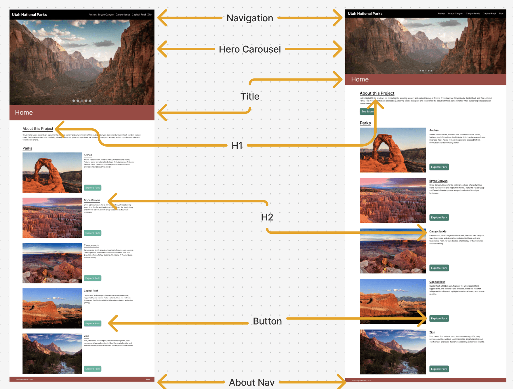
For our user tests we implemented a traditional style of testing, with an observer giving tasks to a user and taking notes while they navigated the website. We tested on both mobile and desktop to ensure we had an accurate view of the whole experience. During our testing we found issues with contrast on our initial button designs, navigation issues when trying to get back to the home page, and some visual hierarchy issues that made the page hard to read.
Based on this feedback, we reduced the size of several interface elements, improved heading hierarchy, increased color contrast, and made a few more adjustments. These changes helped make the site easier to navigate and improved the overall user experience.
This project demonstrated how thoughtful design and iteration can help make digital experiences more accessible. By combining VR tours with a structured and user-friendly website, the project created a way for people to explore national parks even if they are unable to visit them in person.
Working on this project also reinforced the importance of user testing and accessibility considerations throughout the design process. Some of the most impactful improvements came from observing how users interacted with the prototype and adjusting the design based on that feedback.