Recipe Website Design
Summary
Redesign the cookies recipe on the website Joy Food Sunshine
Overview
Overview: The website Joy Food and Sunshine needs to be redesigned to better meet the needs of users.
Problem Statement
Problem Statement: Redesign one of the recipes on mobile and tablet to better meet the needs of users.
Audience
Audience: Users wanting to find recipes on the website, users who enjoy cooking.
Scope
Scope: Redesign the page within a month, through several iterations.
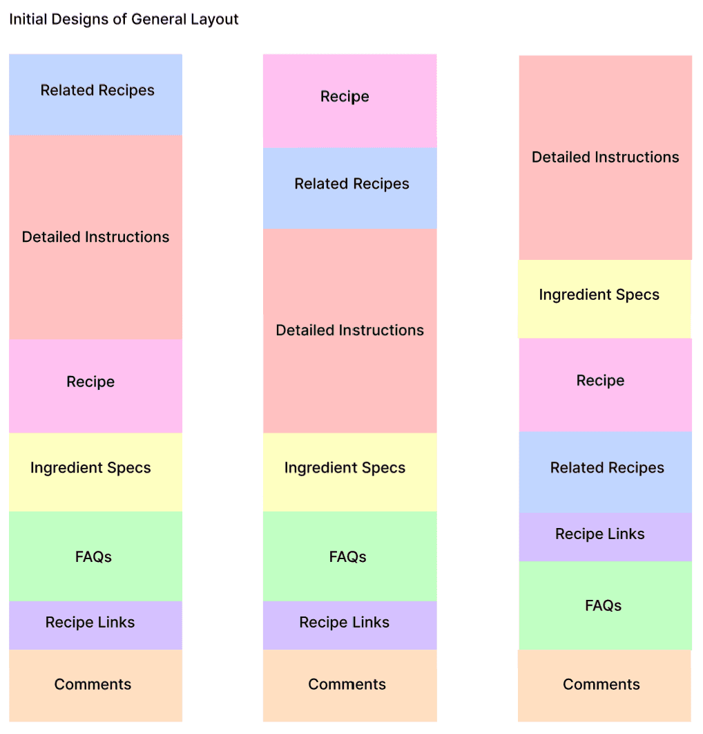
Information Hierarchy
The first step in the process was to consider what was already on the website currently and how it was structured. I found there were seven different sections that I wanted to rearrange to better meet the needs of users. I played around with 3 different methods of arranging the website and finally settled on the far right one. I felt this was the best because it put the recipe higher up on the list of elements, gave room for instructions before the recipe and put less important elements such as FAQs and comments near the bottom of the sections.
Initial Design
This was my initial wireframes of the website, overall, the beginning section stayed mostly the same. I did change around the placement of the “Jump to Recipe” button to be in the center of the page to place emphasis on the button as the recipe is probably the first thing users would want to go to in their use of the site. I did change around the placement of sections match the placement I had made before, but overall after doing this design I realized I hadn’t changed much besides rearranging elements, in the next design I made sure to do so.
This time I added in drop down menus that would contain more information for sections such as ingredients, by doing this I was able to completely remove the ingredient specifications section and compile it into another section. I also applied this to the FAQs section about the recipe, making the question the only visible element with the answer being hidden until you clicked a button. By doing this I made the elements that were most important more visible to users and less cluttered by other information. This step also helped me learn a lot about Figma’s auto layout function, for the drop down menus to work all the elements below have to be in auto layout so they move down as the menus are opened. By understanding this I was able to create a functional prototype that could move and behave as a real website would.
The last step for this project was to add in the text and pictures from the original website and pick colors for the different elements such as drop-down menus and buttons. I also created a mobile and tablet version of the website, which was an interesting challenge to design for. Overall, most of the site stayed the same but with more space to design on some elements had to change for instance on the tablet version I changed the placement of the “Jump to Recipe” button to be left aligned. The reason I did this is because I felt the button would be harder to find in the tablet version because of greater space on the sides but placing it on the left it would align with other elements and be easier to find.
Conclusion
This project pushed me a lot in my Figma prototyping skills, I learned a lot about auto layout and how to properly utilize it. I learned how a design can change when designing for mobile versus tablet versions. Overall, it was a good project that pushed me to grow in my design and prototyping skills.