National Parks App
Summary
Create a fictional app for Joshua Tree national park
Overview
Overview: Create a fictional national park app for Joshua National Tree Park.
Problem Statement
Problem Statement: Design an app that meets the needs of users going to the National Tree Park.
Audience
Audience: National Park enthusiasts, mostly composed of older retired couples
Scope
Scope: Design the app within a month and a half.
Project Scope
The first step in my process was to think about the scope of the project and what kind of specifications it would need to meet users’ needs. But who is the main user? I found that national parks are largely visited by white aging visitors, between 50 to 60 years old. So, my design would need to be tailored to their needs. When creating my plan I identified 7 different aspects I wanted to implement into the final design. Which were creating a map, calendar, some kind of checklist, a news section, campgrounds, volunteer page, and some way for users to share pictures of what they had seen at the park during their visit.
Initial Design
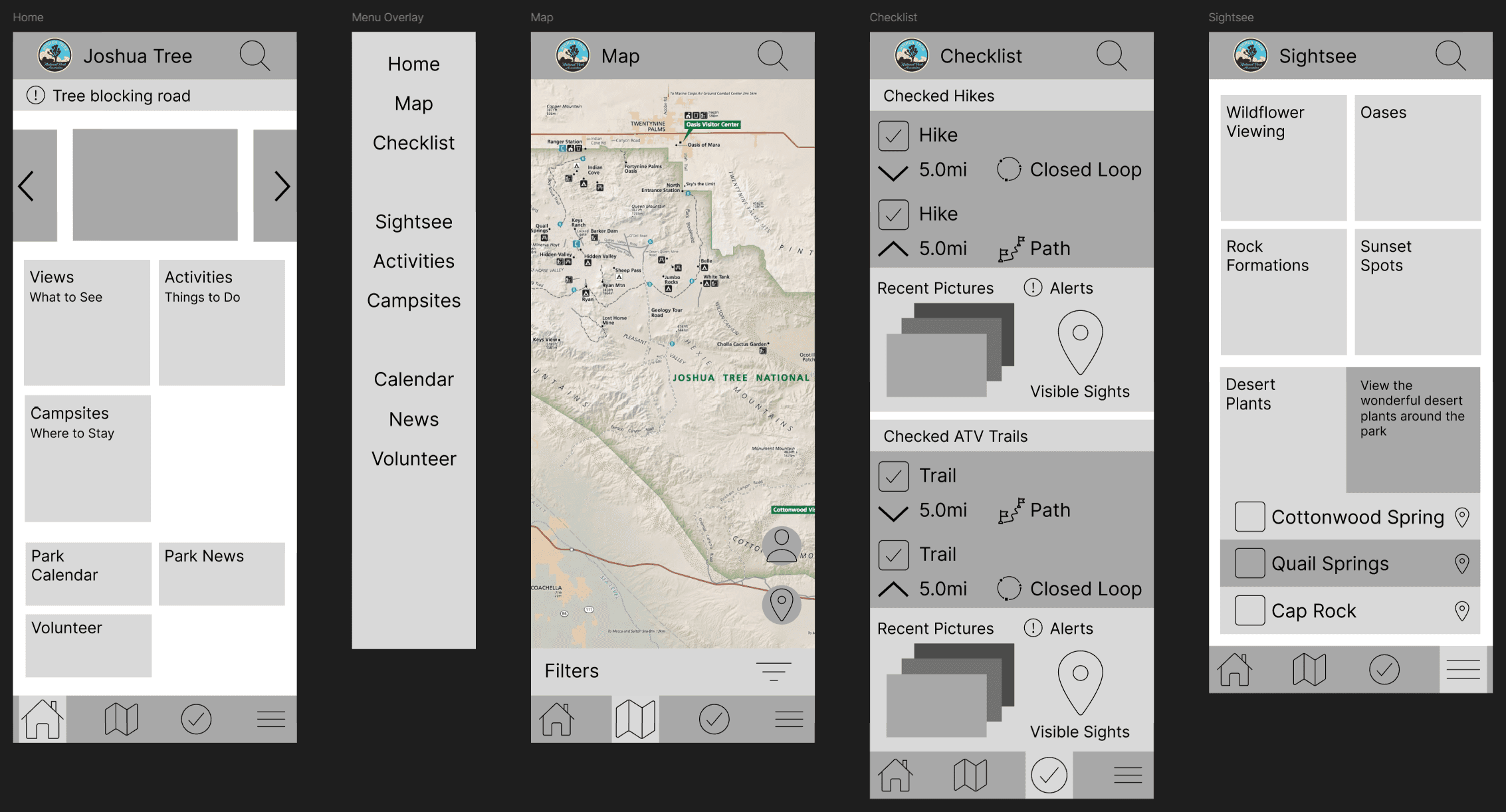
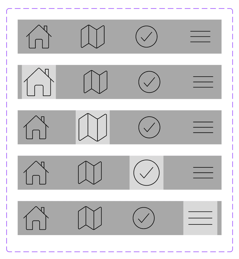
The next step was to create wireframes of my design, I did this initially by drawing on paper the different screens I would need in the final design. The first thing I experimented with was the design of my menu bar at the bottom of the screen, I initially made it have three elements. The home page, maps page, and checklist; with the hamburger menu being in the top right corner of the screen. But after talking with my professor about it I realized that incorporating the hamburger menu into the menu bar increased the simplicity of the design and gave me more design space to work with on the top of the screen. It also would be easier for users to click, because it would be at the bottom of the screen close to where the touch radius of your thumb usually is when using a mobile device.
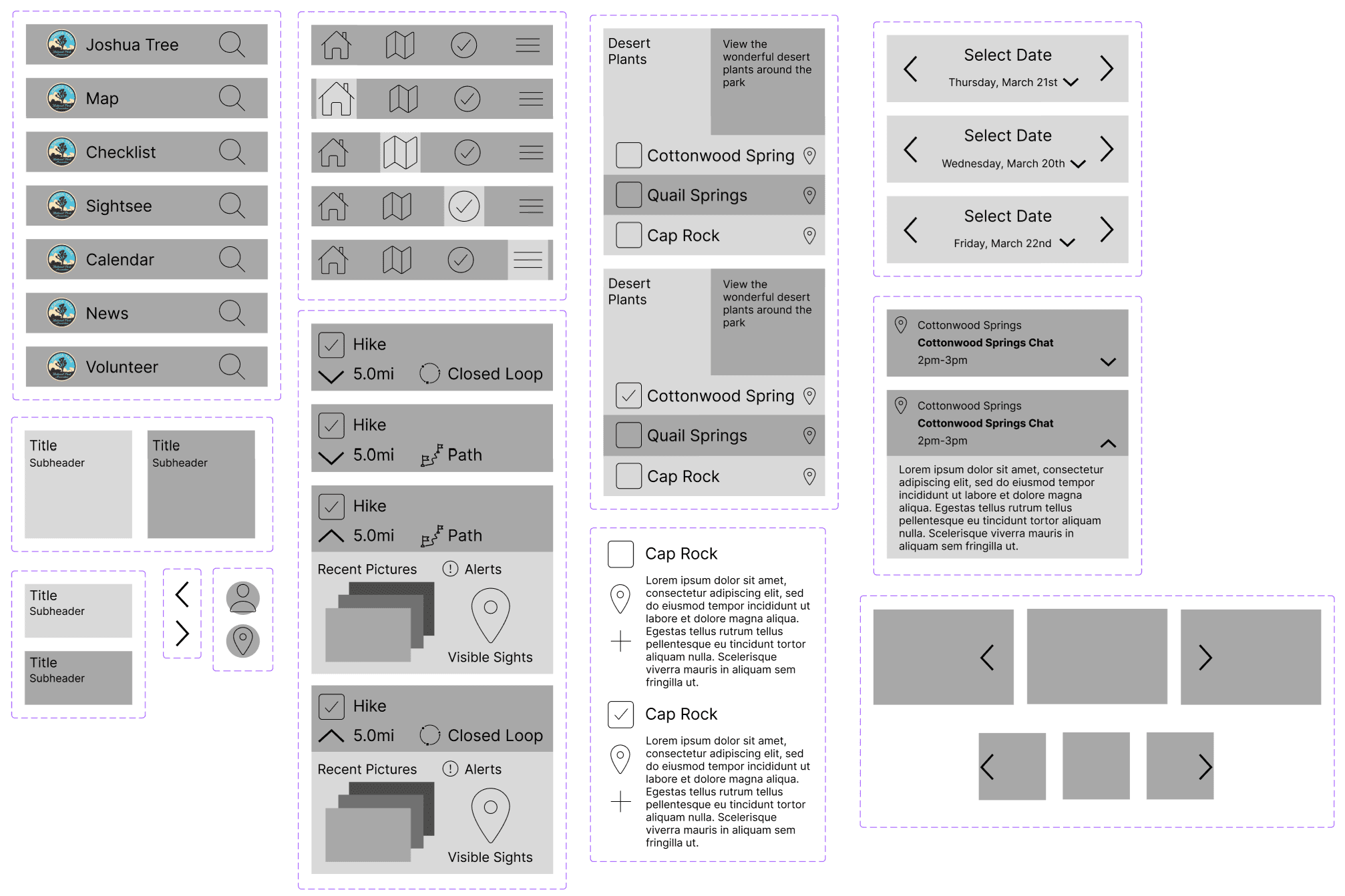
Then I was on to creating wireframes in Figma. I mostly followed the designs I had created on paper, but ended up changing a few things here and there. I created 8 screens for the app to display most of the funcitonality I would need for the final result. When creating these wireframes I was very meticulous to create components of each of the elements I was reusing, as this would make coloring and finishing the design easier to
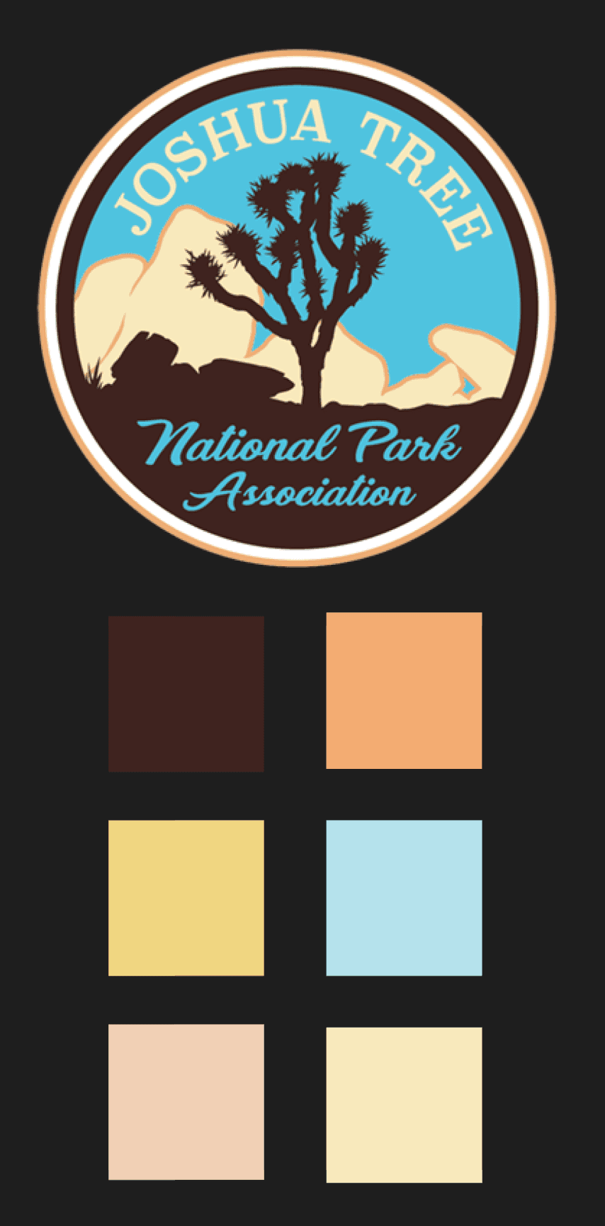
The next step was to create surface comps and a working prototype of the National Park App. For this step I found the Joshua National Tree Park logo and used variations of those colors. I also found that when adding images to various action boxes that the text would be hard to read, so I added a scrim layer to increase the readability of those boxes.
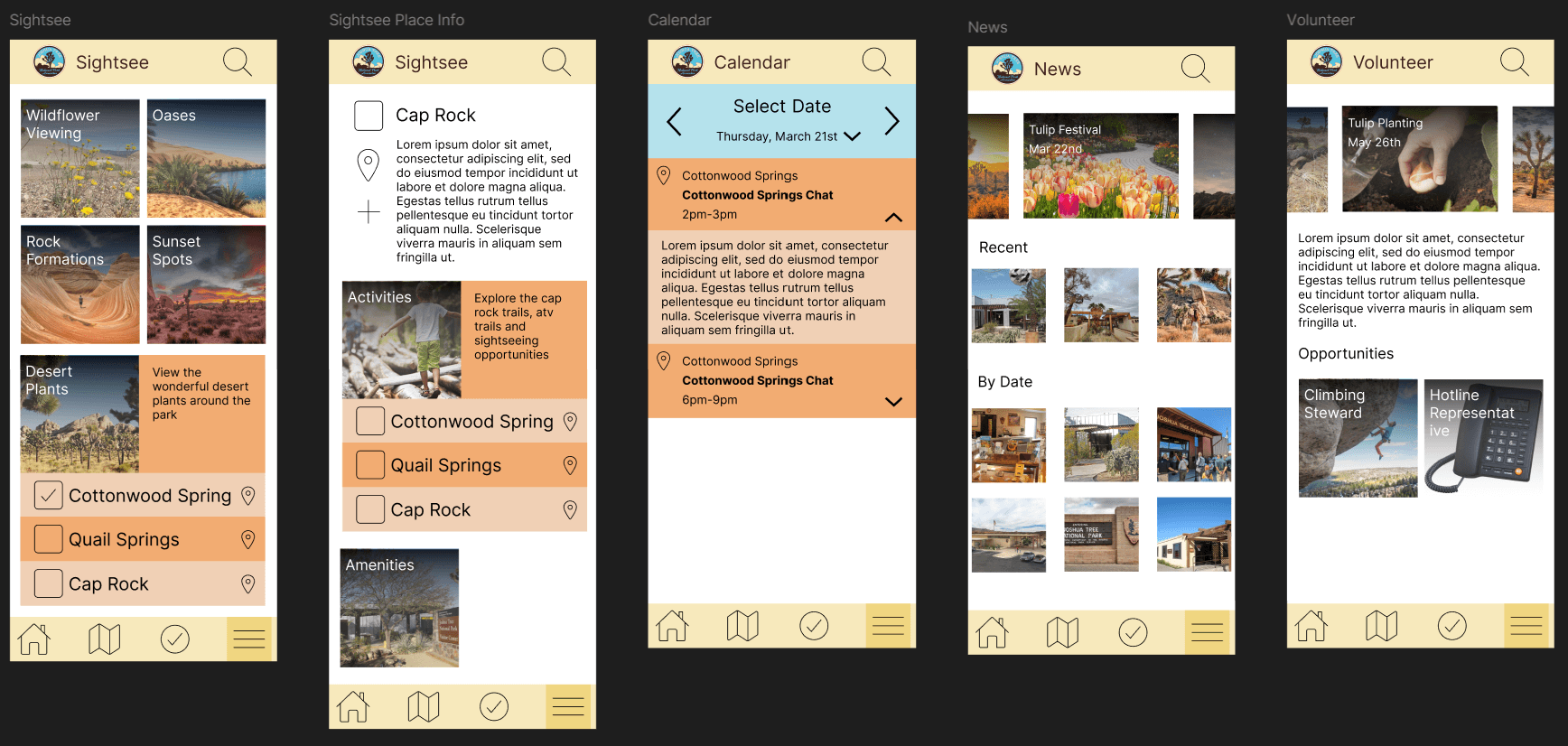
When creating the surface comps I realized that my decision earlier to use components for reused elements was a great idea, as it made the coloring of the surface comp very easy. I was also able to easily change those components to better fit within the design.
Conclusion
When it comes to design projects, spending extra time creating each component might feel like a drag, but it pays off later. By planning ahead and thinking things through, I managed to cut down on the time it took to finalize my designs. This approach helped me work more efficiently and produce better-quality results. Putting in that initial effort really made a big difference in the end!