Hawkwatch International
Summary
Redesign the Hawkwatch International website homepage
Overview
Overview: Redesign the website of a non-profit website.
Problem Statement
Problem Statement: Redesign the Hawkwatch International website to better meet the needs of users.
Audience
Audience: Users who might want to learn more about how to help raptors.
Scope
Scope: Redesign the website through multiple iterations over the course of a month.
Initial Designs
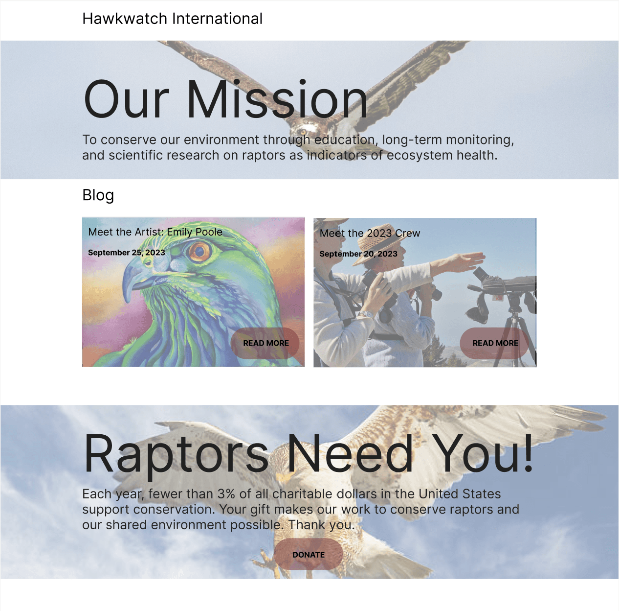
My first step was to create some initial designs for the website. I created two mockups with example pictures of what the design could look like. The first box on both examples were elements I wanted to emphasize so I used big text and a decreased opacity on the background picture. With the blog portion I experimented with a three and two picture view with different variations on the buttons to read more on the subject. I ended up using the first one as I thought it was easier to see against the background and made the button stand out better. Then for the raptors need you section I ended up using the first iteration, because it differentiated the hero box more from the rest of the design.
Reworking the Initial Design
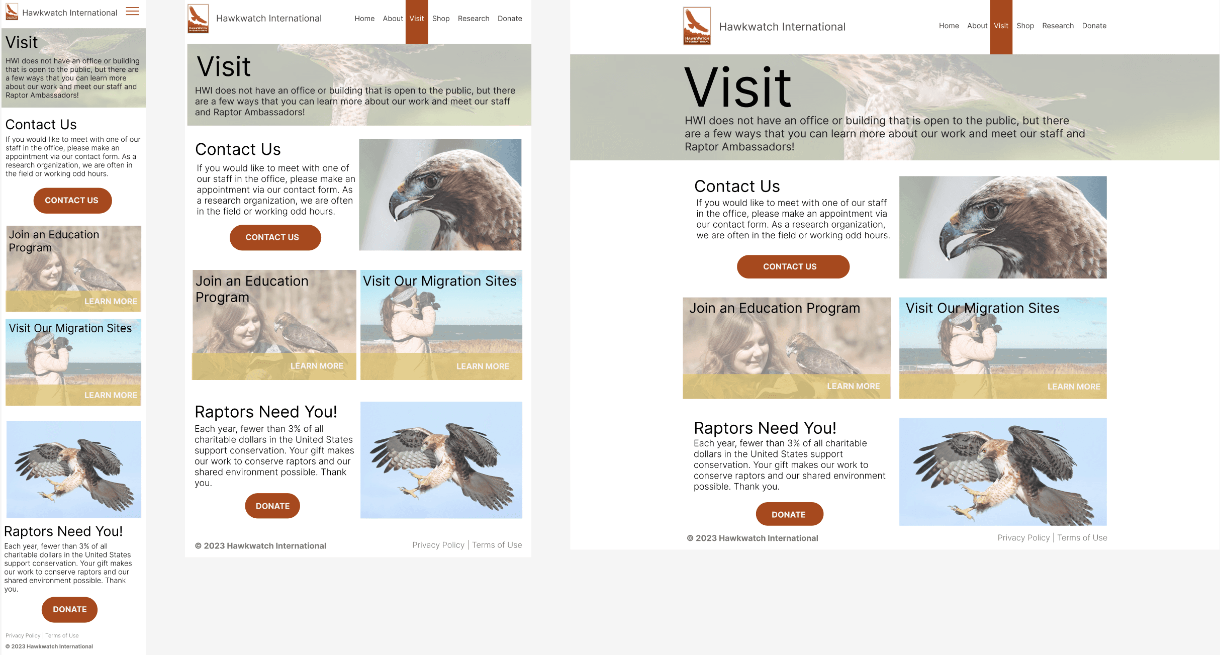
Next, I took the design and designed it for tablet and mobile versions, taking elements mostly from the first design as I mentioned. I also fleshed out the navigation to include the Hawkwatch International logo and reorganized the menu items to be simpler. In the current Hawkwatch International website they have a stacked menu which I realized could be improved by condensing the menu into less items.
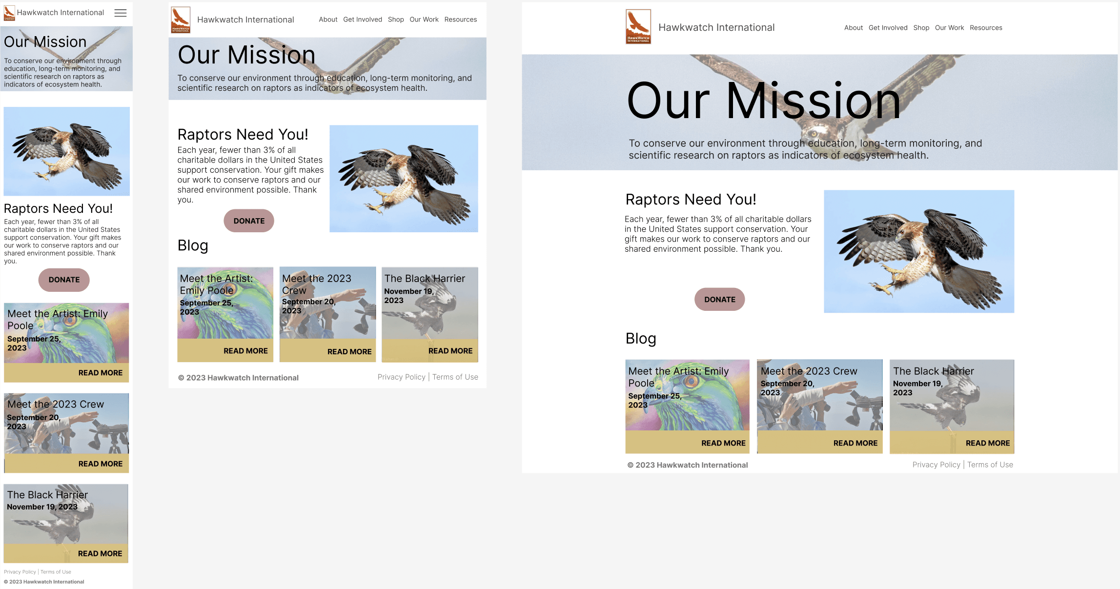
Then again, I iterated on the design I changed around the navigation menu once more, this time I added in the “Donate” button, because funding is key to a successful non-profit I felt this needed its own section in the menu. The next big change I made was changing the colors in the design, I pulled colors from the logo to improve the cohesiveness of the design. I also switched the “read more” button to “learn more” and switched the color from black to white. This change helped make the purpose of the button clearer and changing the color I think looked much better in the design as it distinguishes the button from the rest of the text.
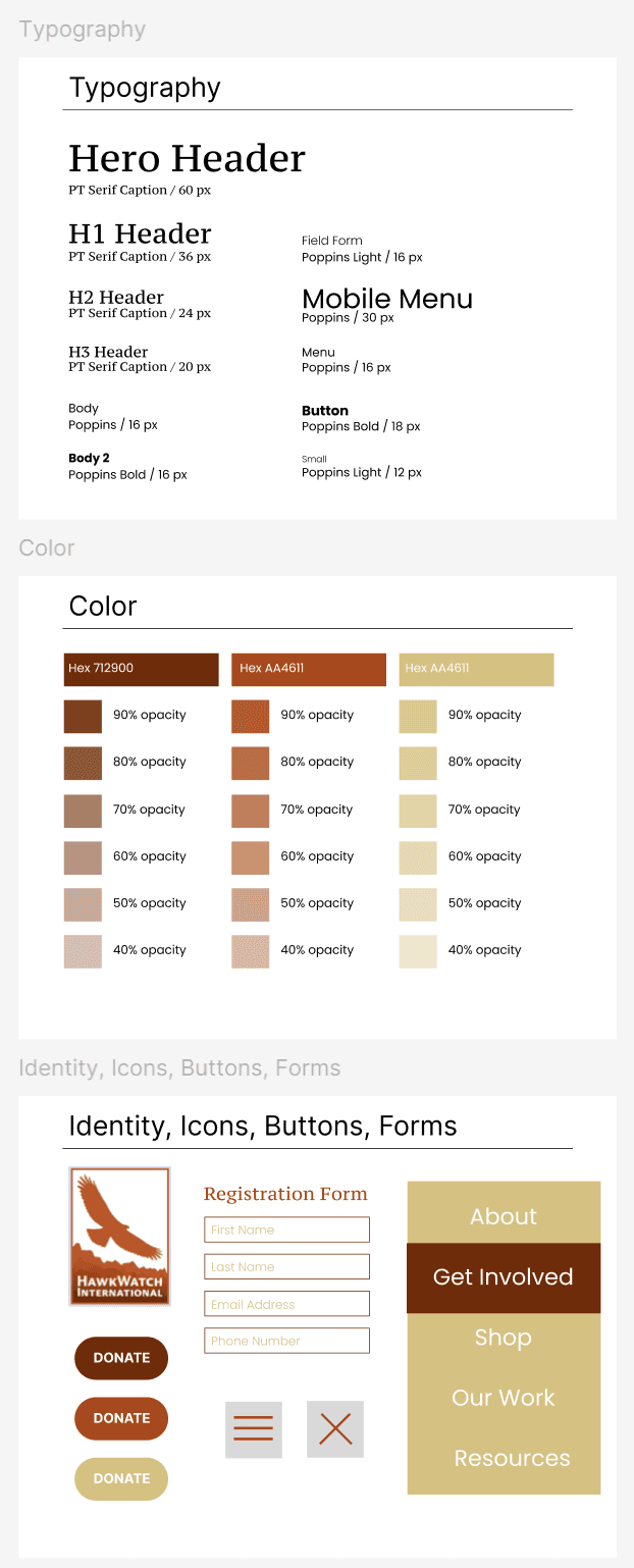
Finally, I was getting to the finished designs, to improve the consistency of the designs I created a pattern library with colors, fonts, logos, and all the elements I would need in my final design.
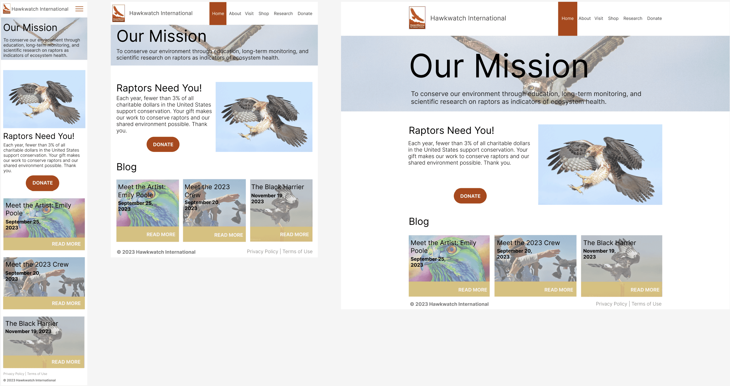
Final Designs and Pattern Library
My final design looked very similar to the previous design, but this time I made sure to use my pattern library to create consistency and cohesiveness. The next thing I did was create a Figma prototype that would function and allow users to see the final design in action.
Conclusion
Iteration in the design process often leads to invaluable insights, even if the final design appears similar to its initial conception. Through iterative cycles, you can gain profound understanding of the design, and uncover nuances and areas of improvement. Each iteration offers a chance to refine and enhance elements, whether in functionality, aesthetics, or user experience. Thus, while the ultimate design may not undergo drastic alterations, the iterative journey fosters continuous learning and refinement, ultimately resulting in a more polished and effective final product.