User-Driven Design: Card Sorting
Summary
Perform research to educate the eventual redesign of the UVU admission webpages
Overview
Overview: Our goal is to identify key issues with the current UVU Admissions website in order to inform a more effective reorganization in the future.
Problem Statement
Problem Statement: The existing UVU Admissions website suffers from organizational challenges that hinder user navigation and overall experience.
Audience
Audience: Alumni, current students, and prospective students of Utah Valley University (UVU).
Scope
Scope: Collaborating with a team of 6 peers over a 10-week period.
What Happened
For this project, we took a "divide and conquer" approach to tackle the different types of research we needed to conduct. The team was split into two smaller groups, each focusing on a specific aspect of the research process. My team was responsible for the survey and card sorting research.
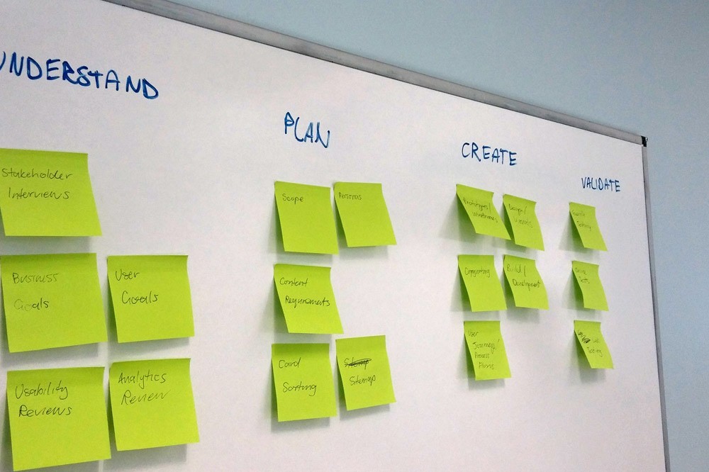
Research
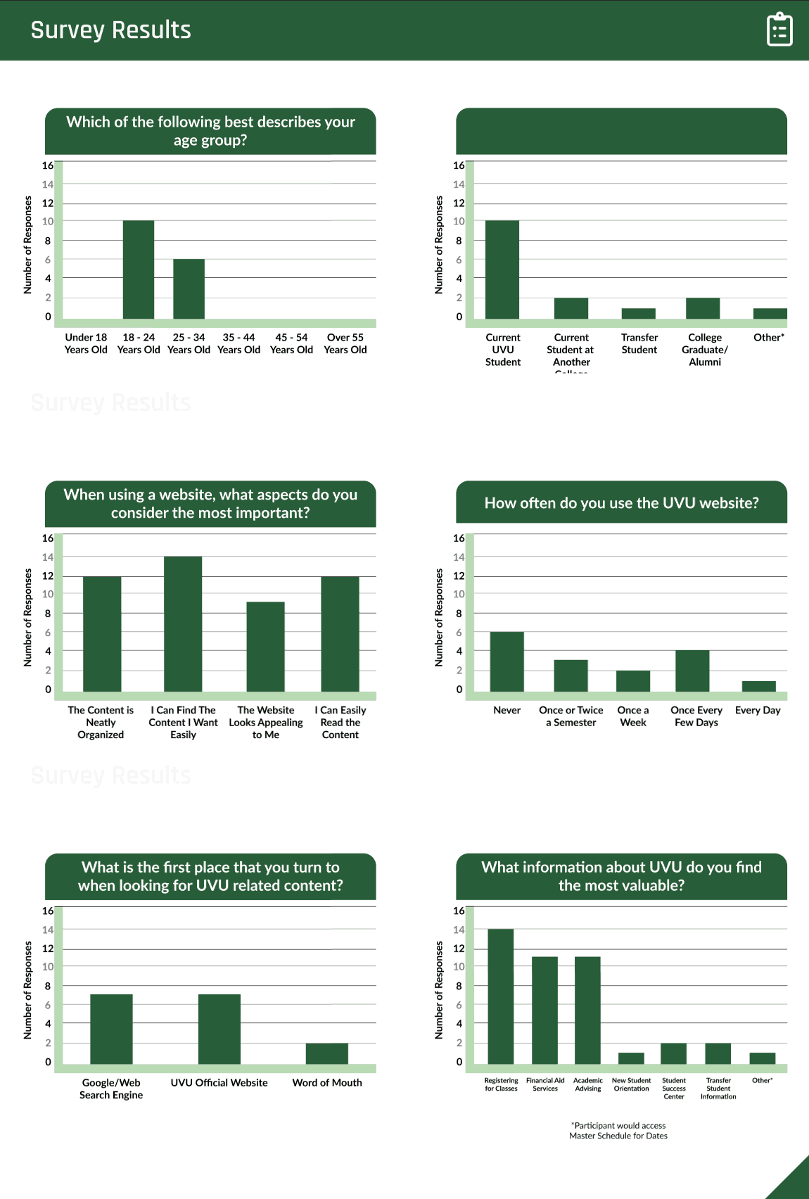
Our survey consisted of a 9-question questionnaire, where we asked participants to evaluate various aspects of the website, share their student status, and provide their age. The responses revealed an overall dissatisfaction with the website, with most participants falling within the 18 to 25 age range.
While my team didn’t handle the usability testing directly, we did observe a think-aloud usability test, where participants were asked to complete simple tasks on the website. The results were telling—most participants struggled to complete more than half of the assigned tasks. Out of five participants, only two managed to complete the first three tasks! From our survey, the think-aloud testing, and additional eye-tracking tests (which I’ll skip the details of here), it was clear that the website had significant issues. A major takeaway was the need for better organization and clarity in presenting information.

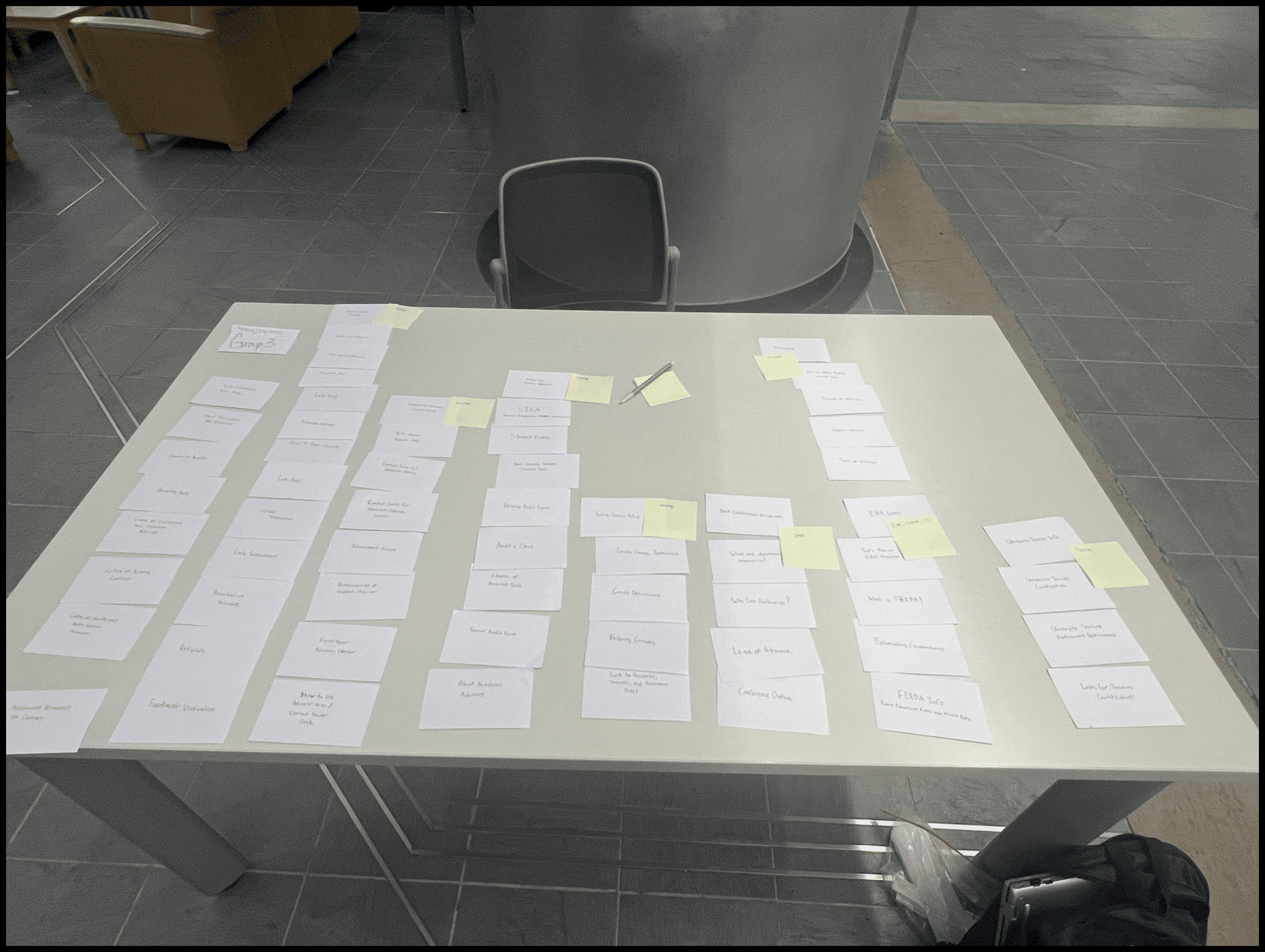
We also performed a card sorting test to see how our audience thought the websites should be arranged. Card sorting is a technique used to help structure and organize information. In our case, we asked participants to sort 50 "cards," each representing a piece of content from the website, such as information about different student types, how to withdraw from classes, and other key details students need to access. After sorting the cards, participants were asked to create their own labels for the groups, which is known as "open card sorting." There’s also a "closed card sorting" method where participants sort cards into predefined categories, but in this case, we wanted to gather insights into how students would name the groups.
Conclusion
These exercises provided us with valuable insights on how the website could be restructured to better meet student needs. It also highlighted key problem areas where students were struggling. While we weren’t responsible for redesigning the website, our goal was to offer actionable data that could guide those making the design decisions. In UX design, it’s easy to get caught up in the aesthetics and functionality of the experiences we create, but it’s critical to remember that the foundation of any successful design is understanding the audience. A great user experience can only be achieved when it truly aligns with the needs of its users, and that alignment comes through solid, thoughtful research.